
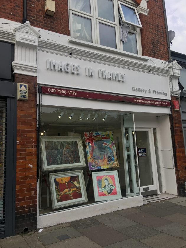
We make no apology for being shop-sign-obsessives. And we have a new favourite – bravo to art shop Images in Frames for their bit of classy work here.
We make no apology for being shop-sign-obsessives. And we have a new favourite – bravo to art shop Images in Frames for their bit of classy work here.
Comments are closed.
What about the eye-hurting kitsch they sell? Guess we’ll skip that.
yes, much better than the old sign and thank you for promoting businesses who care about how the high street look!.
It’s a bit . . . washed-out and ghostly, isn’t it though? . . .
Tasteful signs are obviously preferable to gaudy, neon, plastic, etc, no argument there.
But this obsession with signs that the Conservation Area imposes is all just a bit too precious. I care about general conservation of important things concerning the area, but what kind of SIGN a shop has — I’m sorry, I fail to see how earth shatteringly important or impactful that is.
I care about environmental concerns, rubbish, overdevelopment, not even services or resources, housing issues, etc, but gimme a break, I can’t care about a sign. It’s not the most pressing matter is it?
I have over forty years of history with this area, growing up around here, but these days Wanstead is way up its own “place where the sun doesn’t shine.”
Typo: meant to read “Not ENOUGH services or resources” rather than “not even.”
Takes all sorts.