
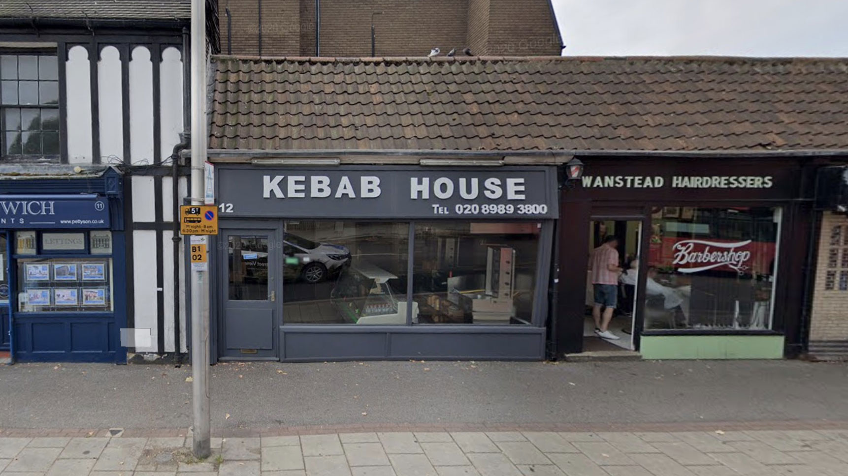
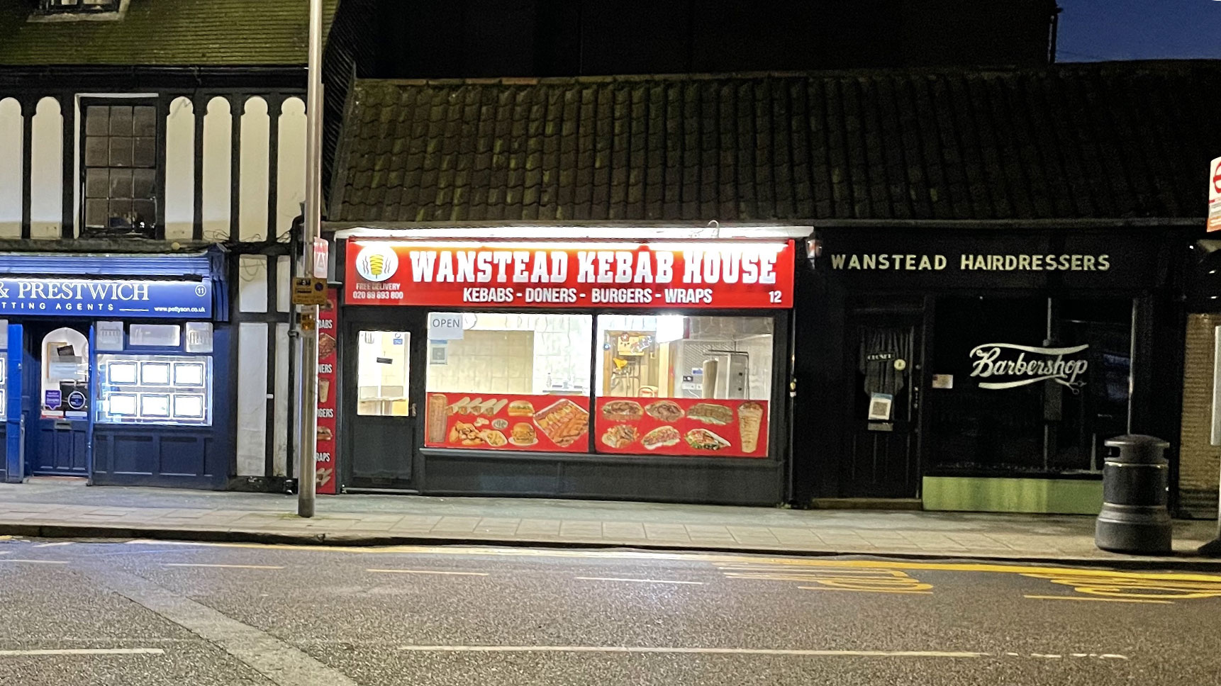
Kebabs are, as ever, a matter of taste. To be brutally honest, the new signage at the Wanstead Kebab House is a little too spicy for Wansteadium’s tastes. But then Wansteadium is rarely content where shop signs are concerned, as everyone knows.
Kebabs are, as ever, a matter of taste. To be brutally honest, the new signage at the Wanstead Kebab House is a little too spicy for Wansteadium’s tastes. But then Wansteadium is rarely content where shop signs are concerned, as everyone knows.
Comments are closed.
New signage is awful. Previous signage had some taste to it
That is disappointing, most similar businesses have moved away from those sort of signs and garish transfers in recent years.
My son noticed the signage yesterday and pointed it out to me saying that’s not in-keeping with the Wanstead vibe. Not sure what I was more surprised with: the garishness of the sign or the fact he knew it didn’t fit in with the Wanstead vibe!
Given that its trade rarely seems to be bustling, I suspect the garish signage is aimed at drawing eyes towards the restaurant and informing/reminding people that it exists
I kinda like the Costa Brava vibe it brings to Wanstead. And thank goodness that tedious ‘on trend’ grey has bitten the dust.
Just because ‘you’ don’t like it, doesn’t mean there isn’t room for it in Wanstead.
I strongly dislike the crimes against typography that the horrible serif fonts of Petty Son & Prestwich commit next door: but as I said, Wanstead is big enough for everyone.
Horrible.
Its a bit sad to see people being critical of a company’s choices when they are simply trying to survive in the most difficult of times. I would have expected to see support from the local community!
What a shame… doesn’t look great 🙁
I suppose they think it needs to be visible from the High St. Which it certainly is now
awful and I will be boycotting. im pretty sure the vertical sign isnt allowed.
Lighten up people. There’s plenty as bad or worse along the High Street. I do so love a menu that includes photos :0)
OMG! DO SOMETHING ABOUT IT. I THOUGHT REDBRIDGE HAD SOME SORT GUIDELINES ABOUT GARISH SHOP SIGNS. MAJESTIC WASN’T ALLOWED TO HAVE AN ILLUMINATED SIGN AND WHAT ABOUT THOSE PHOTO’S AT THE BOTTOM. GET IT OFF!
Also.. look at how disgusting the bottom of the lamp post is.
Wantead residents, you should be ashamed letting your dog’s urinate in public places.
It is right next a a park for crying out loud! Kids, as kids are kids, will touch that.
It is disgusting and you should be ashamed.
To think some signage upsets you, yet you have no respect for the health of others. Plus with the state of the world today I find it hard to believe this is what you are most upset about. Redbridge is one of the worst hit places in the country for COVID 19… Look up priorities in the dictionary please.
lampost loon lampoon.
Think we could tolerate the upper sign – after all , no worse that BHF have inflicted on us, but would be really good if we could get rid of the photos. As commented earlier, I think most of us know what we are going to get in a kebab shop.
Also think they could respond better to customer demand. I asked it they had wholemeal pittas, which I much prefer, and it was met with a complete negative.
Is the problem that the sign is lit up? Exactly like Petty & Son , Churchill’s next door or Piccolo.
Maybe it’s the bright red sign? Exactly like British Heart Foundation across the road?
Or maybe it’s the pictures of food in the window? Exactly like Costa and Gregg’s?
The outrage. Hilarious nimbyism.
All I see is someone trying to earn an honest living, and know there are worse problems in society to worry about…
I’ve got no problem with the sign, good luck to them. It’s tough for shops in the current climate… in fact this thread has inspired me to become a customer… and a repeat customer if I enjoy the food.